Sunday, 21 April 2013

Canvas Heart - Tutorial

One more post for today. I promised that I would do more tutorials, and here is one that I did for one of the retreat layouts. I think it works with the Tim Holtz distress paints really well and I just love the effect that came out.

Smiles, Giggles & Dreams
The background was created with the Crafter's Workshop Kaleidoscope template and Distress Paints.
 
Here's a close up of what I want to show you. The canvas heart.

Step by Step
1. Draw a large heart shape in pencil onto a piece of canvas. Mine measured approximately 5" wide.
2. Cut out your heart.
3. Using washi tape, tape up the edges of your canvas heart and seal it well.
4. Using a spritzer bottle of water, spritz the canvas until it is damp and absorbed. Blot off excess water.
5. Choose the Distress Paints you want to use.
6. Dab and rub the distress colours onto your canvas, in small segments.
7. Spritz the canvas with water and watch the colours blend and wick into each other. 
8. Once you like how it looks, dry it with your heat gun.
9. This is what it looks like dry.
10. Peel off the washi tape and you're left with a raw border. You can fray the canvas a little to give it more texture.

As you see from my close up picture, I then used white distress paint and randomly inked through the Kaleidoscope template. I also used my sewing machine to roughly sew two colours around the border and finally stamped on mini letters to finish it off.

 Here's something else I made for the layout. The pink rose is actually made from a piece of kitchen paper towel. It's basically a used paper towel, which I twisted and spiraled into a snail shell, before sticking on a button. The leaves were made from left over canvas. I stamped a swirl pattern with embossing ink on a patch of spare canvas, before heat embossing with clear embossing powder. I then dabbed on Shabby Shutters distress paint, before free-hand cutting out two leaf shapes. The stamped embossed areas create a resist effect.
Another close-up on the layout.

Products Used
White cardstock by Bazzill Papers
Chipboard, buttons, patterned papers, printed canvas elements and pink crepe by American Crafts Dear Lizzy 5th and Frolic collection
Kaleidoscope template by Crafter's Workshop
Distress Paints by Tim Holtz for Ranger Inks
Canvas from Canvas Corp
Yellow corduroy brads from Imaginisce (discontinued)

I hope you liked this tutorial and will try something like this for your next layout.  I would love to see what you make.

Thanks for looking,


Two Days, Four Layouts

I may have mentioned before that I'm not the fastest scrapbooker, so when the retreat came around, I knew I probably wouldn't get more than five layouts done. I stayed true to form and just like the last retreat, only produced four pages.

Smooch You
 This was based on the April MCS Sketch challenge. I used the MCS February main kit and I like the simplicity of it. Not too many embellishments.
 This is the sketch the layout was based on.
 I like the contrast of love hearts to chevron arrows.
The "smooch" was coloured using the Salty Ocean Distress Paint by Tim Holtz

Products Used
Papers and chipboard pieces from Crate Paper Fourteen collection
Fabric Thickers and Glitter Thickers from American Crafts
Salty Ocean Distress Paint from Tim Holtz for Ranger Inks

Sweet Blossoms
I love this paper line from Webster's Pages, which HKMC released for the retreat. The cameras are to die for.
I love the sticker letters that come with the line. I dripped watered-down splotches of red distress paint around the page.
I can't get enough of the camera paper and just look at the camera washi tape. Swoon.

Products Used
Patterned papers, stickers, sticker letters and washi tape from Webster's Pages Composition and Color collection
White cardstock from stash
Barn Door Distress Paint from Tim Holtz for Ranger Inks

New York
Can you believe this paper is also part of the Webster's Pages Composition and Color line? I jumped on it when I saw it and finally, I could scrap my NYC photos. I printed them to 2.5" x 1.667", so I could fit more on the page. Can you see where I used the camera washi tape again?
I made the paperclip by fastening a brad to a normal office paperclip and gluing it down on the back. It helped keep my mini folder from falling open. I just love the bright pink foam letters for the title. It's perfectly describes NYC.
Here's the resin bottlecap that we made at the retreat. It really is quite cool. Also love the wooden geotag I glued on top.

Products Used
Papers, folders, stickers and washi tape from Webster's Pages Composition and Color collection
Wooden veneer elements from Studio Calico
Pink glitter foam Thickers from American Crafts
Flattened bottle cap from Bottle Cap Inc (yes, there is such a company)
Ice Resin from Susan Lenart Kazmer
Fact & Fiction Brads from Basic Grey

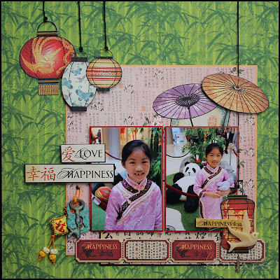
Love & Happiness
 This was based on an April Page Maps sketch. The papers came out last retreat and I did one layout with them for that retreat. I'd been hogging the rest of the collection until now.
 See the lock and key? Those were my VerDay pieces. The little Chinese embroidery charm was sourced locally.
I fussy cut the lanterns and "hung" them on black embroidery thread. The background bamboo paper echoes the bamboo in the photos.

Products Used
Patterned papers and chipboard from Graphic 45 Bird Song Collection
Coloured cardstock from Bazzill Papers
Lock & Key chipboard die cuts covered in Verday Paints from Ten Seconds Studio
Resin bird and embroidered charm sourced locally

So, there you go. My four layouts from the last two days at the retreat. I really do need to up my output next time, although I must say, I do love the time I spend just walking around, looking at what everyone is doing and helping out where I can.

Thanks for looking,


HKMC Spring Retreat Reviewed

We all survived our two day scrapbook retreat. There was a good mix of old familiar faces and newbies. It was great to see everyone in one place again and catch up with gossip and laughs. There were welcome gifts, lots of challenges, prizes and new techniques to learn.

I got to do a small demo on Crafter's Companion Spectrum Noir alcohol pens and we showcased the new Tim Holtz Distress Paints, Verday from Ten Seconds Studio (this stuff is amazing) and Ice Resin by Susan Lenart Kazmer.

 A good view of our participants. Can you spot me?
 Demonstrating how to use the Ice Resin. This can be used for jewelry or paper.
 Everyone had recessed bottle caps to try our resins on.
Gorgeous patina effects with the Verday Paints

One of the events was to use Distress Paints and stencils to create one of four class kits that the HKMC design team came up with. Participants could then choose which one they wanted to follow and got to keep the kits they chose.

Click
 Smiles, Giggles & Dreams
 I came up with two different layouts with the Crafter's Workshop Kaleidescope template and Distress Paints.

This is Life by Carla Keating
 This made use of the Pie Chart template from Crafter's Workshop.

Rain or Shine by Angela McDaneil
 Love the embossed swirls on the clouds.

Easter Sunday by Angela Collingwood
Pretty Easter layout and love the Weekly Circles template by Crafter's Workshop.

All photos courtesy of Angela Collingwood and HKMC, except for my two layouts

Of course, to top it all off, everyone created lots and lots of beautiful layouts. I, myself got four done and I'll be showing you those in another post.

So, all in all, another wonderful and successful retreat. Hope to see you all at the next one.

Thanks for stopping by,

Thursday, 18 April 2013

Always Together, Together Always


This week is a hectic one for HKMC and myself too. HKMC is holding their bi-annual scrapbook retreat on Friday and Saturday, which means lots of planning and organizing. I'm looking forward to this one, as I'll be doing some demos on the Spectrum Noir alchohol pens, as well as playing with some resin and "oxidizing" solutions.

Miss Molly cat helping me pack my crop cart. Urm, I can't really put anything in it if you're already in there.

I've been teaching my Prima mixed media layout this week, and there will be a second workshop next Tuesday evening as well. That was so much fun and I loved seeing all the amazing layouts that came out.

I used Prima's Life Time collection for the class, and have lots of paper and embellishments left over, so I did another layout with them today. I just love, love, love this line, with all the images you can cut out - my favourite are the teacups.

Together Always
 This is such a neutral paper line, just a few muted colours in the form of flowers help to make everything pop. I love how the paper already looks distress and has a printed "mixed media" texture, which takes out a lot of the work for you.
 I crackle painted many of the embellishments to bring in some texture, then inked everything in Vintage Photo distress ink.
 Lots of layering of labels and flowers give more texture to the layout. I love the metal roman numeral dial under the flowers.
 To echo the metal dial, I added a Tim Holtz Roman clock in the same paper, outlining it in the same way as the papers itself. The patterned paper on the far right with the stitched border is actually packaging from the same line.
I spritzed some Glimmer mist on the paper and adding some flourish rub-ons, before layering on the papers.

Products Used
Papers, stickers and flowers from Prima Marketing Life Time collection
Weathered clock die from Tim Holtz for Sizzix
Metallic clock from Prima Marketing Finnabair Metallics collection
Glimmer Mists in browns and pinks from Tattered Angels
Flourish Rub-ons from my stash (I can't remember where these were from)
Metal butterfly sourced locally
Vintage Photo Distress Inks from Tim Holtz for Ranger Inks
Crackle paint from Ranger

Last night, I also came up with two more cards to showcase the Distress Paints from Tim Holtz, which will also be demoed at the retreat. They were both inspired by some other cards that I found on Pinterest.

Love You Card
 Miss You Sew Much Card

It'll be a full on two days, and I expect I won't be able to move or think after it, but I can't wait. It'll be so much fun and I'm looking forward to seeing everyone's layouts and cards.

See you soon,


Saturday, 13 April 2013

Easter Revisited

Hi there,

How is everyone? I'm still slightly off balance with time zones, waking at 3:30am every morning, regardless of the time I went to bed. Not fun.

Nonetheless, there are still lots of pretty papers to play with and layouts to be done. I wanted to get Easter layouts out of the way, so here's another one.

On The Hunt
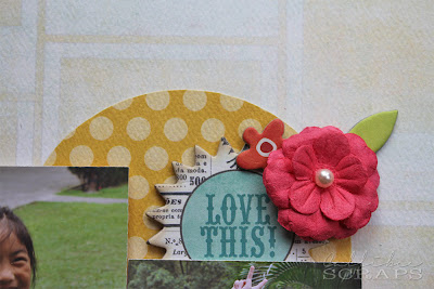
This layout is based on a sketch I found through Pinterest (origin). It's a "boy" sketch, but as you know, sketches can be interpreted the way you need them to be. Love the gorgeous colours and flowers.
I love the "Love This!" chipboard. Hee hee. 

Products Used
Papers and chipboard accents from My Mind's Eye Collectable collection
Flowers from Prima Marketing
Mini alphabean letters from Jillibean Soup
Pink fabric Thickers from American Crafts
Baker's twine from Hemptique

Looking forward to starting some layouts from our holiday, so check back soon.


Friday, 12 April 2013

Spring Cleaning

Hello there,

We're back from our Vegas adventure. We enjoyed ourselves immensely and Miss C is already asking when we can go back again. Mind you, I think going on holiday anywhere in the world would get the same reaction from her. I have some new paper lines to work with soon, so you'll be able to see glimpses of our time there.

You might have noticed that my blog is looking a little different lately. It's been more than a year since I reformatted my blog layout, so i changed the header image and moved things around a bit. Mainly, I re-labeled each post into more concise categories, so it's easy to search for paper lines and themes, as you can see from the right hand column and moved the blog lists to the left side. I hope this makes it easier to find things on my site. Please let me know what you think.

Home a day and I couldn't wait to do a layout, so here's a simple one of Miss C dyeing her Easter eggs.

Dye
I like the whimsical free form placement of the photos and elements here. The colours go well with the patterns in Miss C's dress as well. Don't you love the clipboard matts behind each photo?
 The eggs were cut on my eClips, and then inked. I hand-cut the banners and inked them too.
Cute co-ordinating flowers and wooden accents, sprayed to match, completes the page. It took a while to think of a title short enough for that space, so I kept it simple and just called it "Dye".

Products Used
Papers from Dear Lizzy 5th & Frolic collection
Paper flowers and wood accents from Prima Marketing
Felt flowers from American Crafts
Alpha glitter chipboard Thickers by American Crafts
Distress Inks in various colours from Tim Holtz for Ranger Inks
Heart shaped brads and twin from stash

Don't forget that next weekend (19th and 20th April), HKMC is holding their Spring Retreat, so if you haven't already signed up, now is the time to do it. There will be loads of welcome gifts, prizes and challenges, so join in the fun with us. For more details, check here.

See you soon,


Thursday, 4 April 2013

HK Memory Chest Kit Club - April 2013

Hey all,

Say hello to April showers. Well, they've already starting over here. Lots and lots of rainy days ahead, but at least it's keeping the temperature cool. I love rainy days (not so much when I have to go out in it), but it feels so nice to be sitting inside, staring out at the steady rain falling past my window. There is something so comforting about it - like being cocooned and warm inside. Having said all that, I'm sure I'll be whinging about it a week from now when it just. wont. let. up.

Anyway, to complement the start of spring, we have brought in a gorgeous kit. When we saw this paper collection at CHA, we just HAD to have it. I'm so glad this one arrived just in time for April's kit club - it's so apropos, down to the name, Renew.

April 2013 Kit
2 sheets Authentique Renew "Rejuvenate" papers
2 sheets Authentique Renew "Transform" papers
2 sheets Authentique Renew "Flourish" papers
2 sheets Authentique Renew "Foundation One" papers
1 pack Authentique Renew Puzzle Pieces die cuts
1 pack Authentique Renew Block Numbers die cuts
2 pieces Authentique Renew Petite Folders
1 pack Jillibean Soup Alphabeans in Blended Black
1 pack Jillibean Soup Wise Words in Yellow Happy
4 pieces Jillibean Soup Swallowtail stick pins
1 large and three medium flowers from Prima Marketing
2 feet of dark blue satin ribbon

Add-On Options
Authentique Renew Mini Notes
Authentique Renew Titles and Phrases
Jillibean Soup Wise Words in White Smile
Jillibean Soup Wise Words in Blue
Jillibean Soup Alphabeans in assorted colours

April Sizzix Die
Sizzix Sizzlits Die - Roses Set


 Cherish Family Time
I love the contrast of the blues and yellows with stark black. It just makes everything pop. I really think our subconscious can play a huge part in how we plan our layouts. Only after I finished the layout, did I notice that I had mimicked the mountains in the photos with my torn borders. Odd.
I love itty bitty little letters and the Jillibean Soup Alphabeans letters and wise words are just a joy to work with. I used one of the petite folders to create a hidden journaling spot and used one of the puzzle die cuts for the journaling pull out tab.
 
 You know me and my fussy cutting - the flower pattern begged to be cut out. Also, I love the puzzle message pieces. This was the main thing that drew me to this paper line. So unique.

Extra Elements: black cardstock, Black Soot Distress Ink

Like Me, Like You 
 As always, I do one layout a month for the MCS sketch challenge, and this one is for the current March/April one. When I look at this photo, it's uncanny how much we look like each other. There is so much of me in Miss C, that I had to do a layout based on that.
 I made cute little banner titles and used the butterfly stick pins for each one. Love the block number die cuts.
The roses were covered with sprays and mists to give a pop of colour. Just love the yellow script sticker. Love the faux water droplets - just dot Glossy Accents randomly around the page (inspired by the subconscious again? Because of the rain outside, maybe?)  I also splattered some white ink on the blue back paper and added a faux white stitch border to finish the page.

Extra Elements: Glimmer Mists, Dylusions Ink Sprays and Perfect Pearl Mists, Black Soot Distress Ink, black cardstock, Martha Stewart punches and EK Success punch, Glossy Accents, white tulle netting and doily paper

Other DT Projects

Prima Doll Stamp Tag by Angela Collingwood
 Face Paint by Angela Collingwood
 Pricess Family Memories by Angela McDaniel
Footloose and Fancy Free by Erika Lui
 Hei Hei in the Park Mini Album by Erika Lui
 You Are My Ray of Sunshine by Erika Lui

Here are the kit crop times:

Sheung Wan Crop
9th March (Tuesday)
7:30pm - 9:30pm
Hosted by Erika Lui

16th April (Tuesday)
10:30am - 12:30pm
Hosted by Grace Wong

Discovery Bay Crop
11th March (Thursday)
10am - 12pm
Hosted by Angela McDaniel

If you're a kit member, or even if you also have this collection, I'd love to see what you do with these papers.

See you soon,

You might also like

Related Posts Plugin for WordPress, Blogger...