First paper line is Basic Grey's Indie Bloom line. This line is full of bold colours. Everywhere you look, it's all colour, colour, colour. I love the hippie vibe to it but it can be so much more. Here, I did three layouts with varying amounts of patterned paper to show how you can use this line.
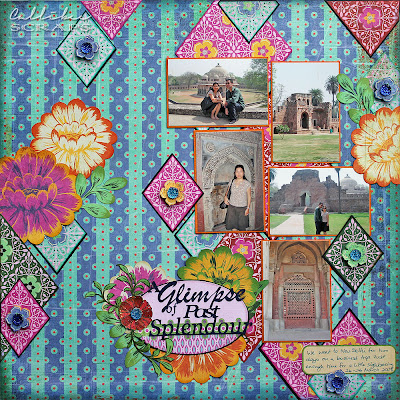
A Glimpse of Past Splendour
This layout is chock full of colour. If you use so much colour in your papers, best to have less colour in your photos or they could get "lost" in your layout. Here I used some photos taken in India and they are predominantly neutral in colour.
I fussy-cut all the flowers and the title was cut using the eClips.
I added a little glitter glue on the flowers before popping them up and adding bright blue sparkly buttons.
Extra Elements: Cardstock by Bazzill, Sparklet gems by Kaisercraft
Day Out in Oz
I kept this layout as simple as possible to emphasize the Opera House roof in the photos.
I hand stitched a border around the page and also around some of the larger matt papers just to make it pop a little more.
Again added more stitching in colours matching the papers.
Extra Elements: Foam letters from Thickers
Sweet Furbaby
This layout uses more papers but I used white cardstock to keep it clean.
Add different types of fonts and textures for your title.
Add clusters of flowers, stickers or other elements to and empty corner to balance off the page.
Extra Elements: Black foam letters from Thickers, Sparklet gems from Kaisercraft


No comments:
Post a Comment