Tuesday, 30 September 2014

September Layouts

Apologies for the lack of posts - I've just been plain lazy about it, which is unforgivable. On the other hand, I haven't had that many layouts to show. I've only scrapped one layout a week, during our weekly crop sessions; daily life getting in the way.

As I sit here and type, I'm watching history take place in my home town. Hong Kong is fighting for democracy and thousands are on the street, in a peaceful protest, asking the Chinese government to honour the promises they made to Hong Kong and its people. Last night, the demonstrations escalated into a shocking debacle, whereby police were using pepper spray and tear gas to "control" the crowds. It was like a scene taken from some apocalyptic film and has caused the city to grind to a halt, with schools and banks around the hot areas closed for the day and public transport scarce. Miss C's school is within the districts affected, so she'll be home for the whole week.

It is at the same time a sad and awe-inspiring spectacle. Sad that things had gone the way they did last night and awe-inspiring the way Hong Kong's citizens and residents have united together to support each other for this worthy cause. Praying that a resolution will be found and Hong Kong can retain its identity in these trying times.

On to the layouts which I feel I should finally post before I completely forget.

First Holy Communion
 Well overdue layout considering the communion took place in June. I was saving this kit from MCS for this particular layout, which is a representation of a sketch that came with another kit.
 A simple layout with a cluster of flowers along one side. I love the flower sprays jutting from both sides of the cluster. This kit came with die cut angels which were perfect for the theme.
I edged the semi circles with lace and the die cut roses were edged to give them more definition.

Products Used
Papers, stickers and die cuts from Kaisercraft Key to my Heart collection
Flowers from Prima Marketing
Alphas from Doodlebug Designs
Distress Inks from Tim Holtz for Ranger Inks
Cardstock from stash
Lace


Yummalicious
 Miss C loves her chocolate shakes and I had to capture her mid slurp, of course.  I love how the colours in the paper match the colours in her outfit. This layout was also inspired by a sketch from MCS.
I love the contrast of multi-colours with the grey background paper - it makes everything else pop so much more. The cute words were cut from from one of the papers.
 This little camera die cut made me giggle as I felt it went with the photo well - Miss C slurps those choco shakes so quickly, they're gone in a blink. The ice cream sundae die cut was kindly given to me by one of my crop mates to complete this layout. Thanks Mandy.
The coloured balls was a sticker strip which I fussy cut. Yummalicious is a word that I use to describe the most yummiest, delicious foods, naturally.

Products Used
Papers, stickers from My Mind's Eye Creative Agenda collection
Brads from My Mind's Eye Now and Then collection


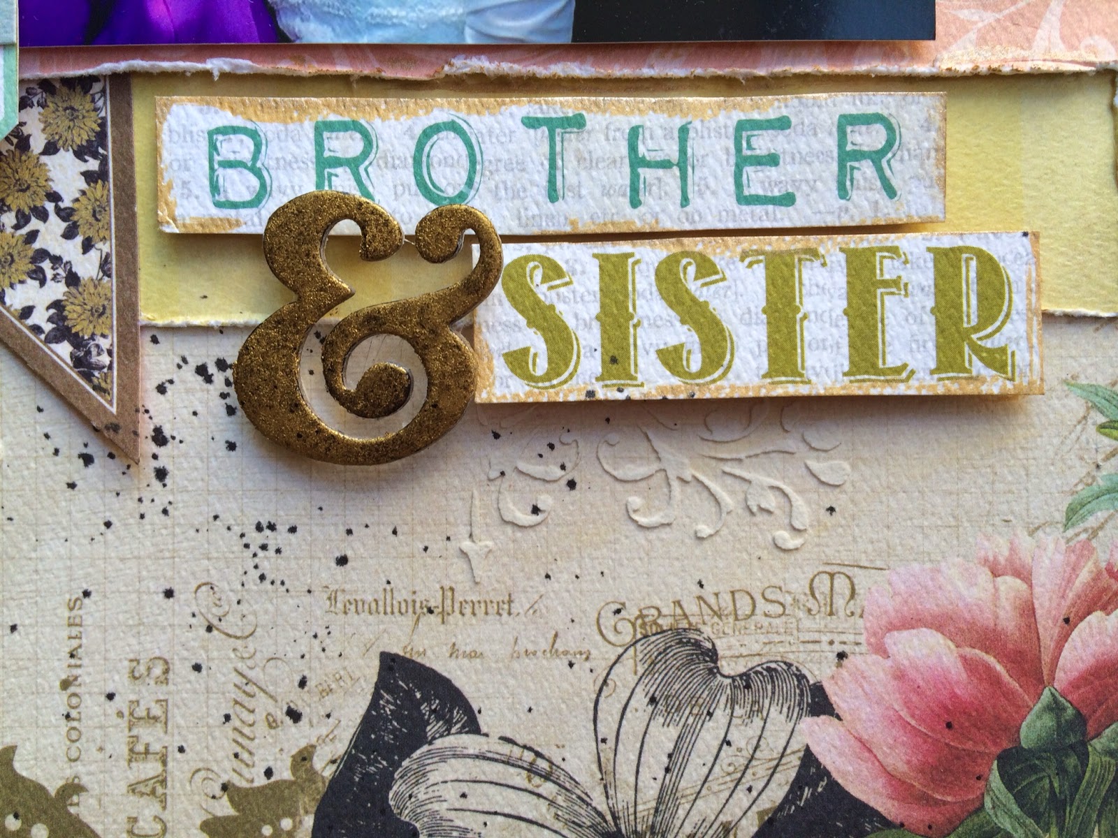
 Brother & Sister
The hubs is the youngest of four siblings and as you can see he's also the only male, which means he was thoroughly spoilt as a kid. This photo was taken at his sister's wedding last summer. I like the subtle gold tones in the paper and tried to mimic that around the page and borders.
I love the gorgeous flourish stencil which came with this kit - it really helps give dimension to the background paper. I layered horizontal strips of different patterned papers behind the photo.
 Funnily, I didn't look carefully at this kit before picking it for the photo and didn't know it had the words Brother and Sister (wish it was sisters) until I was halfway into using it. Lucky pick. I patted gold rub n buff into a chipboard ampersand to tie the title together.
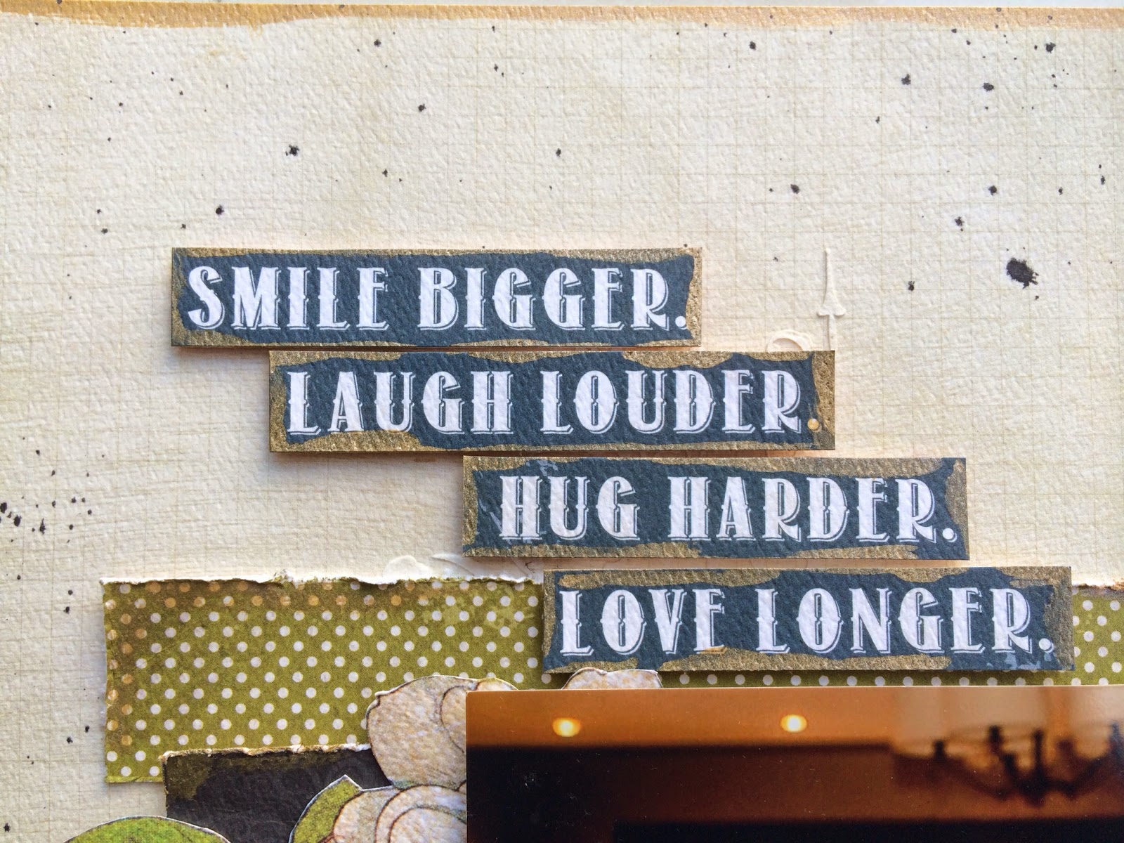
I love this phrase and seeing their relationship with each other, quite befitting.

Products Used
Background paper and die cuts from Authentique Harmony collection
Other papers from Carta Bella Moments & Memories collection
Flourish stencil by Prima Marketing
Light molding paste by Golden
Ampersand chipboard alpha Thickers from American Crafts
Tarnished Brass and Black Soot distress stains by Tim Holtz for Ranger Inks
Gold Rub n Buff

So there we go, the last three layouts I did. My next post will feature the HKMC October kit, so stay tuned.

Hope you enjoyed looking and see you soon,


Wednesday, 17 September 2014

HK Memory Chest Kit Club - September 2014

Can you believe I've been silent for almost three months? It's nice to be back and into the swing of things. We were away in the UK for the whole of July, and although I said I would bring some scrapbooking stuff with me to work on, it stayed next to the night stand for the whole holiday. So bad.

Miss C has been back in school for a month now and really enjoying Year 4. I'm happy as she loves her teachers and friends and the learning isn't so bad either. This year she'll get to go to camp and she already excited even if it isn't until November.

As for me, I've been concentrating on exercising and eating better. The hubby went on a month long detox in Phuket and I joined him for a week. For those who don't know, hubby is diabetic (type 2) and wanted to learn how to reverse the disease. It can be done, but it takes retraining your body to eat the right foods; something that is harder than you think. We learnt all about raw foods and how beneficial it can be for the body. During the detox we fasted, drank clay shakes (yuck), took countless supplements and had daily (twice daily) colemas - I leave you to look that up if you've not heard of them. One week later, I lost 2 pounds. One month for hubby and he lost 13 pounds. It was quite an experience and I think everyone should try it once in their lives. I think we'll try to schedule them regularly.

All in all, we both look at food differently now and I've thrown myself headlong into raw foods and vegan foods. The fridge is stuffed with fruit and veg and even Miss C enjoys some of what I make. There are lapses here and there but overall, I'd say I'm sticking to it quite well. Do I see a difference? I haven't lost much weight, even with the exercise, but I do feel more energetic and the brain fog has lessened. The only thing is planning raw food meals can be time consuming, where some recipes need one or two days of preparation (dehydration, fermentation) before you can put it on the plate.

Between all of this, I've of course had to keep up with the scrapbooking. I can't say I've done huge amount and as usual, after a long holiday, it takes time to get back into it. In fact, I've had to give myself a big shove to start again - in the form of the first kit for the new HKMC kit club 2014/2015 and they are bigger and better than before.

September 2014 Kit
Marion Smith Designs Nirvana - Bliss
Marion Smith Designs Nirvana - Family Record
Marion Smith Designs Nirvana - Print Worthy
Marion Smith Designs Nirvana - Typograph
Marion Smith Designs Nirvana - Up & Away
Tim Holtz Ideo-logy Alpha Parts - Signmaker Black
Marion Smith Designs Junque & Gems buttons - Aqua Vintage
Prima Marketing Shabby Chic Treasures Resin - Baroque Frames
Prima Marketing Shabby Chic Treasures Tassels - Antique
Prima Marketing Junkyard Findings Metal Embellishments - Faucet Wheels
Prima Marketing Junkyard Findings Metal Embellishments - Steampunk Air
Prima Marketing Junkyard Findings Metal Embellishments - Handles & Turns
Trim and handmade fabric flowers

Add-on Options
Prima Marketing Junkyard Findings Metal Embellishments - White Street Signs
Prima Marketing Cartographer Metal Paper Clips
Maya Road Vintage Metal Trinkets - Eureka Light Clips
Marion Smith Designs Junque & Gems resin flowers cream cabbage rose
Marion Smith Designs Clear Stamps - Textured Edges
Sizzix Sizzlets Decorative Strip Die by Tim Holtz - Tattered Curvy Banners

I missed out on doing a sketch layout for this month, but I will be doing them for October onwards.

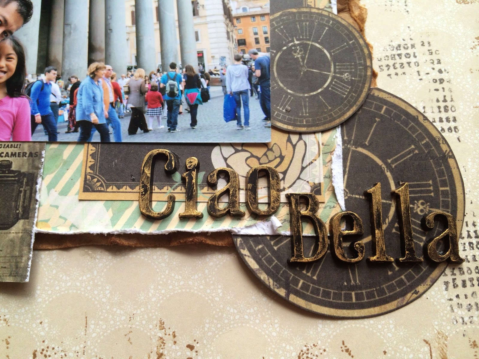
Ciao Bella
I'm loving the vintage feel of all the clocks and newspapers. The photo was taken last year in Rome at the Pantheon. I used the optional stamp to create a border around the page and to pull in the vintage look.
 To add more of that vintage feel, I fussy cut the camera to use as an accent corner
 I love the Tim Holtz black alphas. You can colour them up with distress paints or gild them with acrylic gold paint, which I did here.
I love how the green chevron columns mimic the Pantheon's columns in the photo.

321 Run
 This page is markedly different from the first layout - full of roses and flowers, I matched it with a photo of Miss C running with her adorable little cousin. We were at a wedding in Sweden this summer and they had the largest lawn for them to play chase on while we waited for the bride and groom to arrive.
 Since the background paper and embellishments were quite pale, I decided to die cut some black leaves to make a bold statement and draw your eye to the beautiful resin frame. Just a smattering of flowers from my stash and the cute tassel to finish off my anchor corner.
 I used glass pebbles to frame the 321 numbers and covered the alphas in distress paint so the letters would not compete with the black leaves since they are originally a black as well. On the background paper, I added random spots of stenciled diamonds with modelling paste.
 With the roses on the background paper, I knew I had to dig out my rose die to add some gorgeous roses to the top right corner of the photo frame. A few wooden hearts and small flowers in similar colour schemes finish off the page.

My Love & Joy
 My last page is decidedly masculine in tone and makes use of the metal embellishments that come in the kit. I had planned to use the whole photo but decided to cut hubby out as I like the way he's looking away from the camera.
 I layered strips of the patterned papers and did a bit of layering to bring out the varying textures and patterns. I also die cut out the heart gears, painted them black and added some bronze paint to make them look a bit rusty. I love the metal gears and wheels to match.
 This time I left the Tim Holtz alphas plain as I wanted the stark black. The little propeller is the cutest little accent.
For the background paper, I used white cardstock and sprayed a trio of colours to match. I use Lindy's Stamp Gang starburst sprays and I just love them. It may only have been three colours, but the sprays are so multidimensional that you will find even more colours in there. Again I added more metals to accent this masculine page.

Here are the projects from the rest of the team:

 Our Boy by Belly Lau
 2003 Mini Album by Belly Lau
Together by Belly Lau
 Wedding Card by Angela Collingwood
 Family by Belly Lau
 Funny You by Erika Lui
Love You by Erika Lui
Me by Belly Lau
 You Are Invited card by Belly Lau

Aren't they amazing? Such a versatile kit and you can see just how many projects you can make from one kit. Just look at Belly's projects! They kept coming and coming.

Since I've posted this entry quite late, most of the free kit club crops have already taken place. I was to do mine this Tuesday, but mother nature decided to come knocking in the form of a typhoon 8, so my session has been postponed to next Tuesday, 23rd September from 10:30am to 12:30pm at the HKMC shop in Sheung Wan. If you haven't started with your kit yet, come join me so we can catch up and get those pages done.

See you soon,

You might also like

Related Posts Plugin for WordPress, Blogger...