Sunday, 30 June 2013

Baking and Caking

Hi all,

The last two weeks have been filled with cake making, yet again. Not much crafting done, unfortunately. I did have fun with the caking, though, I got to make a tardis and my other fantasy cake - a merry-go-round.  I think they both turned out ok, although the tardis is a little tilted.

Last Thursday, I had the opportunity to go for a full day decorating course with Kelvin Chua of Vinism Sugarart. Wow, talk about intensive. Nine hours of hand-breaking piping. Definitely worth it in the end though. What a great experience.

This week, it's about cupcakes. Pull-away cupcakes, that is. I've only made them once before, but I've since decided I love making them.

Merry-Go-Round Cake
 The bottom part is cake. The middle and top part are fondant covered styrofoam cores. Since the cake was only for 12 people, I decided not to do the whole cake in, well... cake. The horses turned out so cute and I love the rainbow colours, which the client had specified.

Tardis Cake
As a child, I used to be a big Dr Who fan and remember Tom Baker with his mile long scarf (this probably tells you how old I am). I haven't had a chance to see the 21st century versions. Maybe I should have a look some time.

Shanghai Splendour
 This is the cake (or rather cake dummy - the inside is styrofoam) that I went to class for. The minute I saw this cake course, I knew I had to sign up. I don't get to do a lot of piping and am so out of practice, and this cake design is just so stunning. Thank you to Kelvin Chua of Vinism Sugar Art.

AFL Pull-away Cupcakes Cake
My second pull-away cupcake cake. I'm pleased with how my logo transfer turned out.

I have one more cupcake cake to do for Monday, and then it's caking hiatus until September. Miss C just finished school and we'll be off to the UK from mid July for a month. The rest of the time here will be filled with keeping Miss C occupied and to get ready for the trip - lots to buy for family and friends.

If this piques your interest, have a look here for my other cakes.

Thanks for looking,


Monday, 17 June 2013

Happy Sunshine Girl

Hi all,

It's the start to a busy week - cupcakes and two other cakes to make.  I guess everyone is trying to get all the birthdays out of the way before the summer holidays descend on us. On top of that, I may have a class to teach, and am going on a full day cake course myself. To round of the weekend, there will be a farewell dinner, a birthday party  and I'll most probably have family over on Sunday. Whew. Is it Sunday again yet?

This most probably means that I won't have any time to craft this week, although, I am finishing off something special for someone this week. I'll be able to show you that once I'm done with it.

In the mean time, here is a simple layout that I did last week. This was a quick one hour job. I absolutely love the photos and wanted them to stand out, so the background is pretty plain.

Happy Sunshine Girl
Isn't that the most adorable face? Even with that missing front tooth, that I'm still hoping will come through soon. I really love the blue worded background paper and how the photos and elements really pop against it.
The cutest sun and clouds overlay. Just use a couple of tiny glue dots at the corners to stick them down and you will hardly be able to see them.
Alter a simple title by adding a little more to your title to make it yours. I love the rose die cut for that pop of colour.
Gosh, those eyes get me every time. I call them her laughing eyes. Add little details just to make the photos extra special.

Products Used
Papers, chip board, die cuts and stickers all from American Crafts Mayberry collection
White foam Thickers letters from American Crafts

Thanks for stopping by,


Friday, 14 June 2013

Daddy Will Always Be Her King

Hi all,

Father's day draws near, and of course, I'm again last minute shopping (unsuccessfully, I might add) to get the man in our lives something special. This is where you can see me frantically browsing the web for ideas. Hopefully, I'll be able to get something by tomorrow. Miss C will no doubt be making something for her daddy to accompany the gift(s).

One thing I am on top of is my Father's day layout.

My King
I love this photo so much. It's so poignant as it shows some quality father/daughter bonding time together. Just that image against the waves make it a little teary eyed.
The fabric flowers, leaves and meshing really add texture to the page and lends a girly  juxtaposition  to a predominantly male layout.
I raided my stash for all things "crown". Didn't find many, but this was one of them.
For the background, I sprayed and inked through a "cracks" stencil. I then spread molding paste through a harlequin stencil, before spritzing and outlining some of the diamonds. I really like the burlap and raw cardboard. Such a masculine feel.
I found this quote online (author unknown) and it just hit a cord.

Products Used
Papers and die cuts from Pink Paislee Bayberry Cottage collection
Crackle stencil from Prima Marketing
Harlequin stencil from Crafter's Workshop
Glimmer Mists in various colours from Tattered Angels
Fabric flowers and metal gears from Prima Marketing
Mini Daisy Color Me Crazy flowers from Petaloo
Remnants rub-ons from Tim Holtz
Burlap from Canvas Corp
Paper crown from Kaisercraft
Clear acrylic clock, leaves and black chipboard shapes unknown source
Cardboard and meshing from stash

Hope this will inspire you to do a father's day layout for that special dad in your life.

Thanks for looking,


Wednesday, 12 June 2013

Giant Ducks That Go Quack


Hi all,
If you're from Hong Kong, then you could not have missed the giant duck sitting in Victoria Harbour for the last month. The rubber duck, an art piece by Dutch artist Florentijn Hofman, measuring 32 metres high, sat bobbing in the water for thousands to gawk at. You could see him from the other side of the harbour and I just had to take Miss C into the throngs to have a closer look. It really is quite cute. Sadly, we had to say goodbye to the duck on Sunday night as it makes its way to the next destination.

Quack Quack
 This paper line just came into the HKMC shop yesterday and I quickly grabbed it up as I love the bright colours and thought they would go well with my photos.
I'm also entering this layout for the MCS May sketch challenge.
 Could not resist putting in this title. Placement was a pain but I think I finally got it balanced correctly.
 I love how the flowers from the paper line seem to match the ones on Miss C's dress. (She loves this dress, hence you see it in different settings). There was a chipboard flowerpot, which I filled with large colourful flowers.
  Cute chipboard bird house and labels make it so easy to put together.

Products Used
Papers, stickers, chipboard and clear cut shapes from Little Yellow Bicycle Poppy collection
Large yellow flower from Bo Bunny Blossoms Buttercup Zinnia
Smaller paper flowers from Prima Essentials 5
Blue title letters unknown
Mini yellow alphas from Basic Grey

Thanks for looking,


Saturday, 8 June 2013

Art Trash Mixed Media Plaque - Tutorial

Hi,

Here's the tutorial for Art Trash. I forgot to take photos at every stage, so there will be parts missing, so please bear with my explanations. Hopefully, it will make some semblance of sense.

Art Trash


Part One - Prepping the Wood
The first part of the project was to prep and finish the wood plank itself. At this point, I still wasn't quite sure what I wanted to do to it, but I knew I wanted to give it this weather-worn look.

1. Prep the board by sanding down any sharp edges or splinters.
2. Paint on a couple of layers of gesso. Let dry.
3. Paint on a nice, thick layer of crackle medium. Let dry. Best to let this dry naturally to get the best crackles.
4. After the crackles appear and set, blot on distress stains and inks, buffing as you go so the inks will seep into the cracks. A lot of the colour will rub off as you go, so you may have to add lots to get the effect you want.
5. Add a bit more distress inks to the edges and corners. I buffed on Walnut Stain to it more definition.

Part Two - Decorating your Surface
Here comes the fun part. Decorating your burgeoning piece of art. Sorry I don't have photos for steps 6-8.

6.  Cut a piece of gauze a little larger than the plank. Stretch and tear it before sticking it to the surface with strong glue.
7. Cut pieces of burlap and layer that on top in random areas.
8. In other areas, I glued on pieces of corrugated cardboard. All three of these elements act as my base for all the 'junk' to sit on.
 9. Now it's time to raid your stash and bring out all those little trinkets, flowers and other bits and bobs that you won't be using anymore. For this part, I basically just started sticking things down willy-nilly - no real thought process went into this on placement. I did leave a space for a title, where I used some different fonts and textures.  I actually quite liked it like this and debated leaving it as is, but, I had more planned.
 10. Get out your gesso again and start painting it on. You may need more than one coat to cover up some surfaces, especially metals and plastics. Let dry.
11. For this next step, I recommend using acrylic paints rather than sprays - it just sticks better. I used Luminarte Silks Acrylic Glaze. I just love the colours and how well it goes on. So smooth, like silk. (even I cringed at that one). Make sure you get the paint into all the nooks and crannies to cover up the white gesso. Pretty bright at this stage. Let dry.
12. Using black spray ink (I used Dylusions), spritz over all the colour, darker in some places and lighter in others. It will look pretty dark, but don't worry. Once it dries, it will lighten in colour and you will be able to see some of the paint colours come through. Again, let this dry.
13. For the last stage, I used my finger to rub in a little iridescent bronze acrylic paint on the tips and edges of the trinkets to highlight each piece and to add definition. It really makes everything pop.

Products Used
Gesso by Golden
Clear Rock Candy Distress Crackle Paint from Tim Holtz for Ranger Inks
Distress Stains in Peeled Paint, Vintage Photo and Broken China from Tim Holtz for Ranger Inks
Distress Inks in Walnut Stain and Vintage Photo from Tim Holtz for Ranger Inks
Acrylic Glaze in Honey Amber, Pink Azalea, Teal Zircon, Ginger Peach and Sky Blue from Luminarte Silks
Black Marble Spray Ink by Dylusions for Ranger Inks
Iridescent Bronze Acrylic Paint by Golden

I'm quite happy with it the way it is, but I also want to be able to hang it up, so I'll be getting some screw eye hooks and chain to do that.

There you go. I was able to get rid of some of the stuff lurking at the bottom of my stash drawers and make something cool.

Thanks for dropping by and hope you'll give it a go too.

One's Trash, Is Another One's Art


Hi there,

A few weeks ago, we were given a piece or two of old wood planks by Belly of HKMC and told to do whatever we wanted with it. What an out-of-the-box, but interesting thing to do. After I finished scratching my head on what she meant, I started to think. It's supposed to be an upcycle project of some sort, so why not put a lot of old stash items that haven't seen daylight for a long, long time? Make it look really old and weather worn. This project is also inspired by the talented Anna Dabrowska aka Finnabair, who does the most amazing art pieces.

'Art Trash' Mixed Media Upcycle Project
We were given a blank wooden plank like the one behind my project. The one I used measures 28cm x 10cm (11" x 4")
 Here's the back of the board, which I distressed with lots of crackle medium, inks and paints
 I really like the different fonts and textures of the title.
Can you spot the owl? The zip was from one of Miss C's hoodies which broke, so I had that in my stash.
Lots of flowers I don't use and buttons that have been gathering dust were all thrown in.
Can you spot an ink nib?

In the end, I'm pretty pleased with how it turned out. There were a few instances where I wasn't quite sure how it would look, but I really love it the more I look at it. I still need to add some hooks and chain to turn it into a hanging plaque, and that, unfortunately, is not in my stash, so I'll have to go find that on Monday.

My next post, I'll be posting a tutorial on how I did this. I did miss out on photographing a few stages, but hopefully, I'll be able to explain the techniques I used.

Thanks for looking,

Thursday, 6 June 2013

Fly Little Butterfly


Hi everyone,

Busy, busy making cakes lately, that I've been slacking on my scrapbooking. I was going through my past kits last week to try and reuse some of them. To my surprise, there are still one or two I hadn't even opened yet. The one I used for this next layout was from two years ago, but that doesn't mean it's out of date. The papers are so pretty and timeless and really wonderful to work with. I actually started this layout last Friday and didn't finish it until last night. That's probably the longest it's taken for me to finish off a layout.

Fly Little Butterfly
Lots of butterflies and flowers to complement the flower photo. I love how dreamy it all looks.
 Layers of lace and a mix of flowers add lots of dimension. I added Stickles to the mini alphas to make them shine.
How pretty is the background paper. Just so romantic. I added a tear and backed it with a contrast blue paper.
Lots of butterflies were cut from the patterned paper and covered in Stickles.
I love the cameo in the middle of the large flower. Also love the banners with the liquid pearl dots and the little crystal bling I randomly dotted around the page.

Products Used
Papers, cameo and stickers from Bo Bunny Gabrielle Collection
Large flower, roses, alphabet stickers, stencil and crystal bling from Prima Marketing
Hydrangea and mini flowers from Petaloo
Stickles and Liquid Pearls from Ranger Inks
Light Molding Paste from Golden
Walnut Stain Distress Ink from Tim Holtz for Ranger Inks
Various lace from stash

There are a couple of projects floating around, half finished, but hopefully, I'll be able to show you all soon.

Thanks for looking,


Wednesday, 5 June 2013

HK Memory Chest Kit Club - June 2013

Hello there,

Summer holidays will be upon us soon and that also means the last HKMC kit for the kit club year. It runs from September to June (missing out July and August) and we're finishing it off with a bang. I've been eying this kit and loved working with it.

June 2013 Kit
1 sheet Simple Stories 24/Seven Bingo Cards/Strips Paper
1 sheet Simple Stories 24/Seven Snap Shots Paper
2 sheets Simple Stories 24/Seven Good Stuff Paper
2 sheets Simple Stories 24/Seven Today Paper
2 sheets Simple Stories 24/Seven Hello Paper
1 sheet Simple Stories 24/Seven Fundamentals Cardstock Stickers
1 pc Hampton Art Deco Runner Arrow
1 pack Little Yellow Bicycle Wood Look Alpha Stickers
3 pcs x Little Yellow Bicycle Wood Pins
3 pcs Little Yellow Bicycle Burlap Stickers
4 pcs (12") jute twine in various colours to match

Add-On Options
 Little Yellow Bicycle Burlap Stickers - Ribbons
 Little Yellow Bicycle Burlap Stickers -Stars
 Little Yellow Bicycle Cork Pins - Flowers

May/June Combination Sizzix Die
Sizzix Movers & Shapers Die - Pocket Envelope plus one pack of selected embossing folders (2 folder per pack) - collected in May

Miss Molly
 This is the first layout I've done of my new furbaby. She is such a sweetheart and has become my little shadow. Here, I turned the photos to black/white as the backgrounds were too distracting. I think it makes her stand out even more against the layout. Don't you love the yellow chevron?
 The wood look alphas go so well with the papers. I mixed it with the Jillibean Alphabeans from the April kit.
I added some wood veneer cats that I'd bought to do a cat layout and I think they go really well with the burlap/felt hearts.
More kitty cat wood veneers and and extra half circle accent to balance off the page.

Extra Elements: Wood Veneer cats from Studio Calico, Jillibean Alphabeans

@Play
Hexagons are still a big hit and the colours on these ones go well with my blue/red photos. I used plain yellow cardstock for the background so not to clutter the layout with too many patterns.
 I tore off the original burlap badge on the burlap ribbon and added one of the stickers instead. I also stuck the wood pins into the foam pop dot underneath to secure.
 A stitched circle with the twine gives a playful vibe and balances out the hexagons.
 Love the banner stickers. So easy to use and so versatile.
Off! Miss Molly. Within two seconds of me laying the page on the floor to photograph, and she's already on it. See? My shadow.

Extra Elements: yellow cardstock from Bazzill 

Disneysea  Signboard Mini Album
 I recently (finally) got myself on the Cinch bandwagon and this is my first project with it. A 4" x 5" stand up album. This was inspired by one of the ideas given by Heidi Swapp, using a used cereal box for the core. I cut it down to the size I wanted and covered it with kit papers.
I then cut out extra pages from the kit papers and matching cardstock to make my flip album. I topped it with a clear acrylic page, where I placed the title and again with a yellow chevron banner piece to finish it off.

Extra Elements: Red and green Bazzill cardstock, Cinch binders

Here are some of the layouts from the rest of the team. Amazing work from everyone.
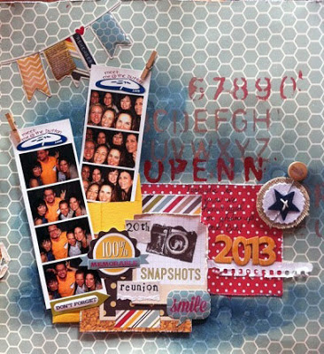
Reunion by Angela Collingwood

Blue... It's the New Pink by Angela McDaniel

Play Ball by Angela McDaniel

Greece Summer by Erika Lui

Love This Boy by Erika Lui
Sheung Wan Crop
11th June (Tuesday)
10:30am - 12:30pm
Hosted by Grace Wong

11th June (Tuesday)
7:30pm - 9:30pm
Hosted by Erika Lui

Discovery Bay Crop
13th May (Thursday)
10am - 12pm
Hosted by Angela McDaniel

For all the kit members, I hope you had fun with the 2012/2013 kits. HKMC will be coming out with a new kit year 2013/2014 in September and hope that you will join us in creating those layouts.

Thanks for dropping by,


You might also like

Related Posts Plugin for WordPress, Blogger...