Wednesday 26 September 2012

Mini Art Journal - Finished projects

Hi all,

I had six lovely ladies join in the class last night and they had so much fun. Messy fun, but fun nonetheless, making these pretty girls come to life.

I really love the Suzi Blu stamps that we used. The shop brought in so many designs and I couldn't resist getting a couple more. They are so versatile and you could use them from cards to journaling to putting on your scrapbook layout. No artist genes? No worries. Just stamp the girl on your page and colour her in. Or do paper collage. It's all up to you.

Here are the gorgeous art journal covers that the girls did. Aren't they wonderful? They all chose their own colours, giving each girl a different look.

Can't wait to start on the inside pages next week.

 Photo courtesy of HKMC

There is another class for the covers tomorrow evening (Thursday 27th September) and remember we will be doing the inside pages on the Thursday 4th October and Tuesday 9th October (same class, taught twice). You will need to have the outside pages done first though. So, if you're interested, please give Erika a ring at 2559 0175 or email to info@hkmemorychestonline.com.

Hope you liked them.

Grace
xxx


Monday 24 September 2012

12 Tags of 2012 - September

Hi All,

I can't believe it's almost the end of September already. I've had to keep this monthly mini project on the back burner and wanted to get this done before I forgot it completely.

I love this technique by Tim Holtz. So effective yet simple. I will definitely be using more foil in my layouts in this way. Thanks again Tim for another wonderful tag.

Tim Holtz's September Tag
Look at that metal finish. It's amazing how you can achieve this look.

 My Version of Tim's Tag
I used slate, ginger and stream alcohol inks colours. I had the camera instead of the typewriter which I used with a "capture the moment" metal tag. I added a glass bevel over one of the sprockets for added interest. I love clocks at the moment, so used that instead of the ink nib. Wish I had the light bulb as that is such a cute accent.

Hope you like it.

Grace
xxx

I Will Not Go To Bed

Hi All,

Sometimes it's not enough to just scrap all the nice pictures. You want to do the funny ones, the sad ones, ones that tell a story. That is what it's about, right? I've been meaning to use these photos for a while. I'm sure Miss C will want to kill me when she sees it, but too bad - they are too adorable to leave alone. She's never been one to throw tantrums and when she does, I need to capture it. The photos were taken in low light, so are not the best of quality, I'm afraid.

This was another of my retreat layouts. I just needed to print the journaling at home before considering it complete.

I Will Not Go To Bed
 I kept the whole layout pretty simple as I wanted to highlight the expression on Miss C's face. I wanted the layout to look like a hanging frame as she has so many that I made for her room and door, so to me, it sort of tied in with this being her bedroom.
 For the frame, I measured around the three photos and cut it out with my Fiskars, inked it and pop-dotted it to give a 3D effect. Of course, I have to have my bling, so just a sparklet in the middle of the flowers to finish it off.
Just a little journaling to explain the photos a bit more.

Products Used
Papers from Crate Paper Restoration Collection
Foam and chipboard letters from Thickers
Sparklets from Kaisercraft
Brads, eyelets and jute non-branded

Thanks for dropping by.

Grace
xxx

A Couple of Layouts From the Retreat

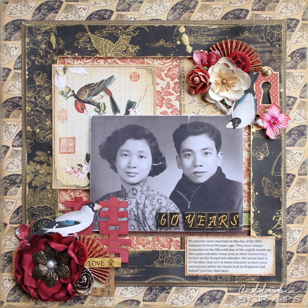
I'm not known to be a quick scrapper. I usually take 4-6 hours to do one page and I cannot leave things alone until I'm fully satisfied that it is complete, so when you give me twenty hours of non-stop scrapbooking, it doesn't mean I'll be churning out 20 pages. For this retreat, I came out with four! My all time low, actually; last retreat I did five pages. I think I spent more time chatting and catching up, helping out with anyone who requested it and also doing an eClips demonstration. All part of the experience, in my opinion.

Here are two that are complete. They are also part of a couple of challenges that were set out. The other two, I still need to tweak a little and add some journaling.
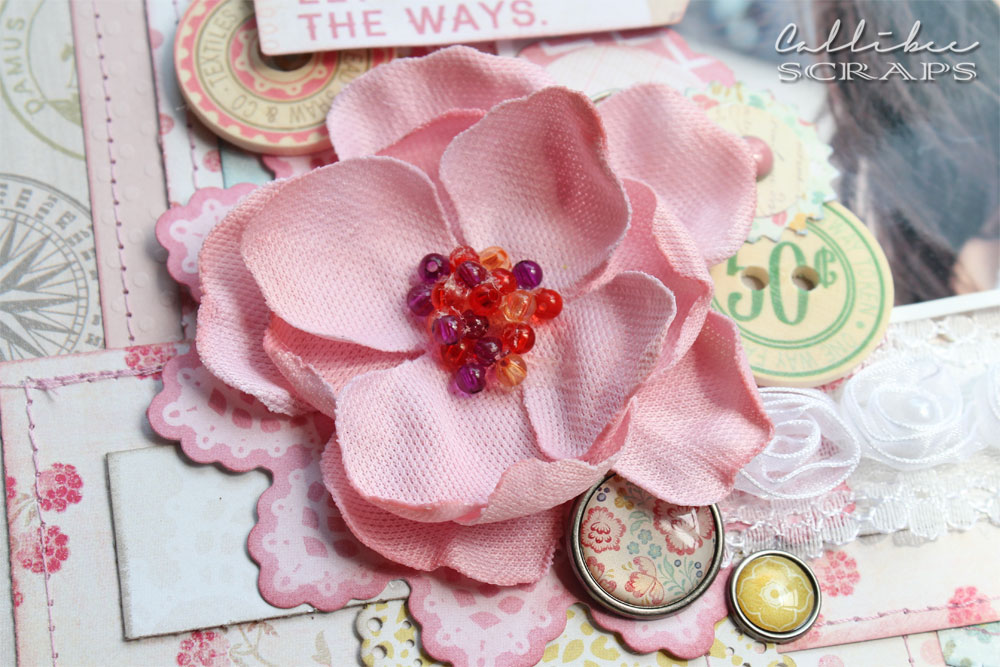
 Beautiful Belle
Each person was given a pack of Webster's Pages papers and embellishments and asked to create a page. We were also all given an Epiphany Crafts pennant punch and epoxy pennants as a welcome gift and also had to use these in the layout.
 I added extra embellishments that I brought with me; flowers, bling and the rub on cage and bird. See the epoxy pennant with the butterfly encased inside. I love this little gem of a punch so much.
 I cut out a couple of butterflies to fill in the little space under the flowers on the top right corner. To finish the page, I added silver Stickles around the page, circles and butterflies.

Products Used
Blue scallop papers, pleated grey ribbon and lace from Webster's Pages
Other papers from Prima Marketing Sun Kiss collection
Flowers, bling from Prima Marketing
Rub ons from DCVW Mariposa collection
Silver stickles from Ranger
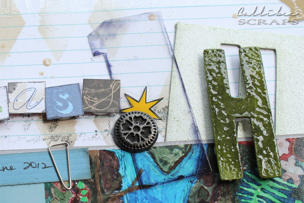
Class 1H
These were new school papers revealed at the retreat.  For the challenge, we had to use some chipboard letters, acrylic shapes and button brads that were given to us.  My first thought was to keep the page clean and simple, but as usual, my hands would not let me do that. I took inspiration from the large painting behind the kids in the photo and I had to add a little grunge edge to it. As a matter of discretion, I blurred the other children's faces on photoshop for this blog.
For the title, I cut one of the acrylic arrows into a "1" and used the button brads to hold it in place. The "H" was inked and embossed with Utee.
The books border was hand cut before being placed at the bottom of the page. I stamped the other acrylic arrow before embossing with distress powder. Heating it up causes it to curl. While it is still hot, I pressed it between two flat surfaces. I again used a brad to hold it down.

Products Used
Papers and transparency die cuts from Little Yellow Bicycle Making the Grade collection
Chipboard letter from Making Memories
Acrylic arrow shapes from Clear Scraps
Silver button brads from Imaginisce
Stencils from Crafter's Workshop
Inks and distress embossing powders from Ranger Inks

Hopefully, I will have time to finish off the other two layouts and get them posted. Next week will be quite busy with classes to teach and also a mid-week cake order.

Thanks for looking.

Grace
xxx

Sunday 23 September 2012

Last Retreat Paper Reveal - Graphic 45 Bird Song

I had one more paper reveal that I couldn't get out on time before the retreat to post. I was working on this until 3am in the morning before the retreat and didn't have a chance to photograph it before having to pack up everything to take to the retreat.

This is based on the Bird Song papers from Graphic45. I love their papers; always so bold and different. You have to love their vintage style and turn-of-the-century (last century) vibe.

There have been many Asian (Chinese and Japanese) influenced lines lately by other paper brands as well, but I love that HKMC brought this one in. These papers feature mostly Chinese motives, with the phoenix and dragon, Shanghai girls mini posters, lots of Chinese calligraphy and ink paintings. They even have Japanese Geisha girls which are ideal for cutting out.

Here is my first layout with this paper line. It's a wedding photo of my parents. Gosh, they look extremely young here. They met as students and didn't have the full white dress wedding as they were in China during the Mao reform.  This year they celebrate sixty years of marriage and have one of the most amazing relationships I ever seen. I can only hope to have what they have when hubby and I get to that age.

60 Years
I kept the layout simple with a frame to highlight the amazing wedding photo. When I work with old photos, I first scan them into my computer and print out a copy to work with. I inked all the papers with gold rather than brown as I wanted to keep the layout bright but vintage at the same time and gold is also a Chinese colour.
A cluster of flowers in similar shades complement the paper. See the similarity between the white flower and bird on a branch that I cut out to match the blossoms on the painting underneath.
 I die cut a red "double happiness" character with my eClips to add to the wedding theme. I scored and folded some mini fans to tie in with the backing fan paper. I fussy cut the pair of finches and perched them on opposite corners of the photo.
Is this not the most romantic story? The mid-autumn festival is also regarded as a lover's day. So befitting.

Extra Elements: flowers by Prima and Petaloo. Brass trinkets and flower from stash. Gold paint by Ranger Adirondack Metallics.

Thanks for dropping by.

Grace
xxx

Exhausting, but Exhilarating Two Days

Hi all!

Whew!! That was two wonderfully tiring days at the retreat. As predicted, we talked and caught up, we laughed uproariously, we ate (too much), we exchanged ideas, we oohed and ahhed over each other's layouts, scrambled our way through challenges, grinned ear to ear with new gifts and prizes and above all, got some amazing pages out there.

The first night, I think all of us crashed immediately upon getting home. We were, therefore, pretty set for the second day.  With giant cups of coffee in hand, we were ready to tackle another day. Too bad the day felt too short this time. It was over so quickly and I'm already in withdrawals, waiting for the next retreat.

Here are a few pictures (courtesy of Erika from HKMC):

All the DT samples up on the mirror. Look at the products for sale on the tables below.
Class page in progress.
Hard at work.
 Love all the circles.
So colourful.
Completed class layout.
Hard at work? Or hard at chatting.
Get that inking done.
Beautiful mess.
 Gorgeous layout.

Thanks for looking.

Grace
xxx

Friday 21 September 2012

Retreat Paper Reveal - October Afternoon 9 to 5

This is such an interesting paper line. It has the "Mad Men" office vibe and you don't see many "work" papers like this. It was fun to work with as it made me think very hard on how to use it. I turned it around into a back-to-school page and also another page for my hubby.

It Is Time For Year 2
There is a good balance of "office" patterns as well as florals.
 The mini letter stickers are my favourite. Adding a stitching line through it takes it from plain to cool.
Each circle and square is stragetically placed on the page to add balance and interest.
 The little clock button is the cutest. And I of course used an authentic office date stamp for the date.

Extra Elements: Black shiny letters by Thickers

You Are My Rock
 The dark wood effect paper is a wonderful contrast to the other papers and accents on the page.
 The title was cut out with my eClips. I layered different papers behind each word and left the arrows blank so it showed the wood paper underneath.
I cut strips of black/white paper to imitate washi tape. I added the little file folder of labels behind the photo to give a little more interest.

Retreat Paper Reveal - American Crafts Chap

Chap is a small line from American Crafts based on simple geometrics. I found them perfect for male pages, so I did one on my dad and one for hubby.

Remember the Time
 The background paper reminds me of sixties decor, so I dug out this photo of my dad during that era.
 I added extra accents from Kaisercraft to bulk out the layout.
 For the black grid paper, I embossed the grid with black distress powder.

Extra Elements: Black cardstock from Bazzill, Ties and moustache accents from Kaisercraft, buttons from stash

Road Trip
 I love these photos of hubby and his best mates since his school days. They looked so young. And skinny. These guys are still good friends to this day. I sprayed over a circle stencil for the background to give a little more interest and did a double sewed border around the page.
The white scallop was again embossed with the Chap stamp set. I added some glass pebbles just as a small finish to the page.

Extra Elements: Grey cardstock by Bazzill, Foam letters by Thickers

Retreat Paper Reveal - My Mind's Eye Lost and Found Halloween

I love this time of year; school is back in session, the weather is getting cooler and the whole autumn vibe is in the air with the promise of Christmas (my favourite holiday) around the corner. But, before that is the funnest (not a word) holiday. Miss C loves deciding what she wants to be every year (this year it's Hermione Granger). She even loves all the scary stuff and thinks vampires and ghouls are cool. Not one to scare easily, my girl.

For this year's Halloween line, we have brought in the wonderfully sparkly My Mind's Eye Lost and Found Halloween. It's basically a three toned paper line with the orange accented with lots of glitter.

Not So Scary Halloween
I inked everything with black soot distress ink and also added more to the top edge, letting it drip down the page.
I die cut the banner and added gold embossing powder around the edges.
See all that lovely orange glitter?

Extra Elements: Shiny foam letters from Thickers

Retreat Paper Reveal - My Mind's Eye The Sweetest Thing

This is another paper line to be introduced at the retreat tomorrow. We already put out two of this line's collections: Tangerine and Bluebell.  This time, we will put out Lavender and Honey. I chose the Lavender line to work with, while my friend Angela worked with the Honey line. I hope I can get some pictures of her layouts to post here later.

The lavender line has a lot of soft pastels, especially pinks and yellows. I also either desaturated or whitewashed my photos to suit the colour palette.

It's In Her Smile
This layout will also be my submission for a sketch challenge with My Creative Scrapbook, so it may turn up again in a separate post as part of the competition requirements.
This pretty pink canvas flower adds the 3D element to the page.
I added machine stitching to most of the paper. I really adds an extra visual effect to the layout. 

Extra elements: flower by Prima, large SMILE letters by Thickers

There Is No One in the World Just Like You
I based this on a layout I saw in a magazine but cannot remember which one now. I kept it simple with small elements dotted around the page.
Little elements keep the page whimsical and floaty.
Balance out the page with a smaller accent corner.
The title is a mixture of die cut letters, stickers and chipboard.

Extra Elements: pink/orange butterfly by Kaisercraft, Wood effect chipboard letters by Thickers

Beautiful Family
 I made this layout for an eClips introduction class that I did last Tuesday evening.
 The lace and title frames are all cut by the eClips.
A little pop of yellow stops this layout from being to monotone.

Extra Elements: Lily, butterfly and black flourish by Kaisercraft, cardstock by Bazzill

You might also like

Related Posts Plugin for WordPress, Blogger...